After thinking about other music magazines front covers, I'm a bit concerned that my ideas so so are not conventional enough, and may not appeal to my target audience. So, the screen shot above shows the 3 current options for my front cover so far, I believe the cover on the far left may be more conventional but I'm interested to find out which my target audience will actually prefer. So, here I have also created another questionnaire (using a different website and software) and will collect the results and continue with the rest of my magazine to accommodate their opinions.
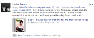
 To the right is a screen shot of a Facebook status which I made to alert and hope for more people to give me feedback, and as soon as possible! Also, Facebook is widely known to be mainly used by teenagers and students, and also my reader profile questionnaire showed that my target audience's favourite social networking site is Facebook, so I should get some helpful feedback.
 Results:
4 people completed this question, 2 of which said they preferred the front cover on the far left, and 2 said they preferred the font cover on the far right. But, saying this, the two that answered that preferred the one on the left either didn't elaborate on their decision and explain why, or they put a very simplistic explanation. Whereas, the two people who chose the third front cover were able to give a more detailed explanation on why they like it, and they both said that cover looked more like a professional music magazine than the other two options. So, from these results, I will continue to work on the third magazine front cover, which was my original front cover.


No comments:
Post a Comment